How do I use the Overview tab in Preference Test results?
Table of contents
In this help, we’ll explain the information found in the Overview tab:
Summary
Time Taken
Top Locations
Summary
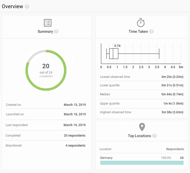
The donut chart tells you how many respondents participated and how many actually completed the study
The numbers of respondents who completed and abandoned the study are also displayed below
Created on is the date when the study draft was first made
Launched on is when data started being collected
Last respondent is the date when somebody participated in the study most recently
Time Taken
A breakdown of how long it takes people to complete your study
The candlestick chart displays the time range in which respondents completed your study
The bar illustrates the upper and lower quartiles with the line inside marking the median value
T-shaped ‘wicks’ in the candle chart mark the highest and lowest times that it took to complete the study
Top Locations
The top three countries that your respondents came from
Location is determined based on the respondent’s IP address and as such can be inaccurate (such as when the respondent is using and out-of-country VPN or other means to obfuscate their presence online)
Summary, time and location
The Overview contains the big picture of the Preference Test study. Use the summary to keep track on the current state of the study, Time Taken to see how long it takes respondents to complete, Locations for where they came from.
We need your consent to use cookies
on our website to provide you with the highest level of service.
You can change the settings by clicking the "Settings" button.
These cookies are necessary to ensure the operation and basic functions of the UXtweak website.
They store information about your UXtweak session and help protect your privacy.
Analytics cookies
These cookies are used to analyze traffic on our website, so that we can better understand our users
and improve the site's content, usability and functionality.