

When to use a tooltip?
Tooltips can be used in various situations to provide additional information or context to users.
Here are some common scenarios where tooltips can be helpful:
- Unfamiliar icons or symbols: When using icons or symbols that may not be universally recognized, tooltips can help clarify their meaning or purpose.
- Abbreviations or acronyms: If you have abbreviations or acronyms within your interface or content, tooltips can provide expanded explanations to ensure understanding.
- Form input validation: Tooltips can be used to display validation rules or error messages when users hover over or interact with form fields, helping them understand specific input requirements.
- Navigation or menu items: When there are complex navigation structures or menu items, tooltips can provide descriptions or clarify the functionality of each option.
- Instructional cues: Tooltips can guide users through unfamiliar processes or features by providing step-by-step instructions or hints. They help greatly with onboarding for complex unfamiliar software and tools.
- Data visualization: In charts or graphs, tooltips can display additional data points or details when users hover over specific elements, enhancing the understanding of the visual representation.
Benefits of using a tooltip
- Enhances clarity and usability: Use tooltips to provide clear explanations, instructions, or additional information that helps users understand the purpose or functionality of UI elements and certain features. This improves usability by reducing ambiguity and guiding users towards their goal.
- Optimizes space and attention: Tooltips help to optimize screen space by displaying supplementary text only when users need it, preventing interface clutter and cognitive overload. Tooltips in UX Design serve as visual cues that draw attention to important elements and guide users’ focus.
- Supports accessibility: Tooltips can benefit users with disabilities by offering supplementary information or alternative text for certain elements. They provide an opportunity to convey information that may not be easily perceivable for users who rely on assistive technologies.
How to create a tooltip?
Creating a tooltip involves a combination of UI design and development steps. The key step here is to define exactly where it might be needed and pinpoint design elements that require additional context.
Here’s a high-level overview of how to create a tooltip:
- Define the content: Determine what specific information or context you want to display within the tooltip. This could be explanatory text, additional details, instructions, or any relevant content that is essential and adds value to the user experience. The content should be clear and concise, so you may want it to be written by a professional UX writer. Don’t use tooltips to overload your design with unnecessary information.
- Design the tooltip: Decide on how your tooltip is going to look. Ensure it aligns with your overall interface design and branding guidelines.
- Choose trigger events: Identify the events or actions that will trigger the display of the tooltip. Common triggers include hovering over an element, clicking on it, or tapping on mobile devices.
- Implement interactivity: Write the necessary code or markup to enable the tooltip’s interactivity. This may involve utilizing HTML, CSS, and JavaScript to create the tooltip’s structure, styling, and behavior. Implement event listeners and handlers to trigger the tooltip’s appearance and disappearance based on user interactions.
- Test and iterate: Test the tooltip thoroughly across different devices, browsers, and screen sizes to ensure its functionality, responsiveness, and visual appeal. For that, conduct usability testing with representative users with the help of online usability testing tools.
FAQ
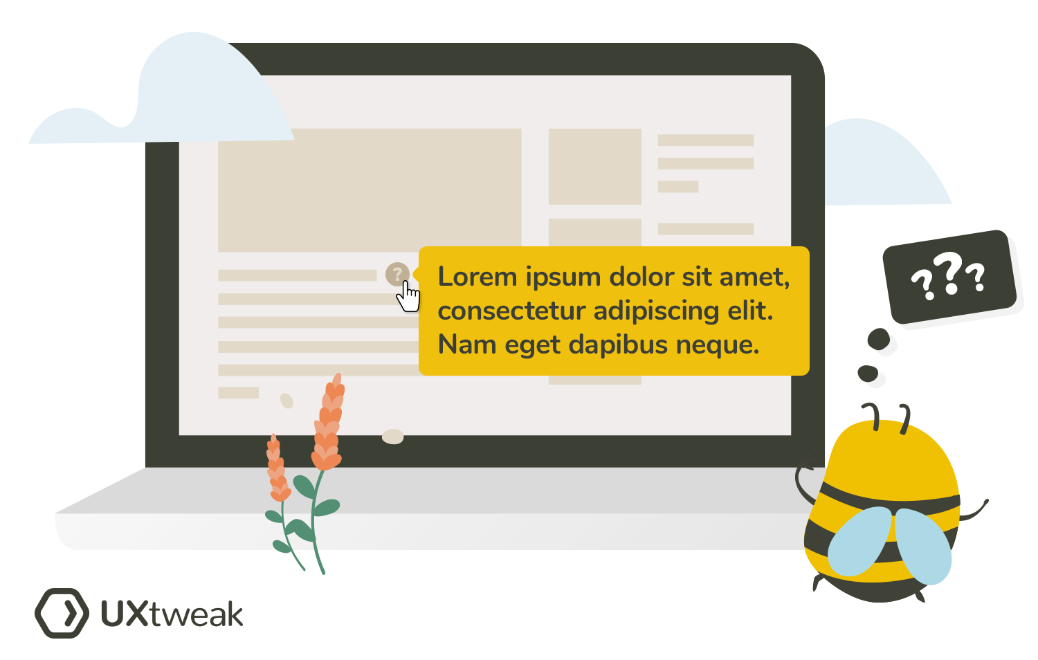
A tooltip is used to provide additional information or context about an element in a user interface. It helps users understand the purpose or functionality of the element and enhances usability.
An example of a tooltip is a small pop-up box that appears when a user hovers over a button, displaying a brief description or instruction about the button’s function. For instance, a tooltip can appear when hovering over a shopping cart icon, showing a message like “View your shopping cart” to provide clarification to the user.
