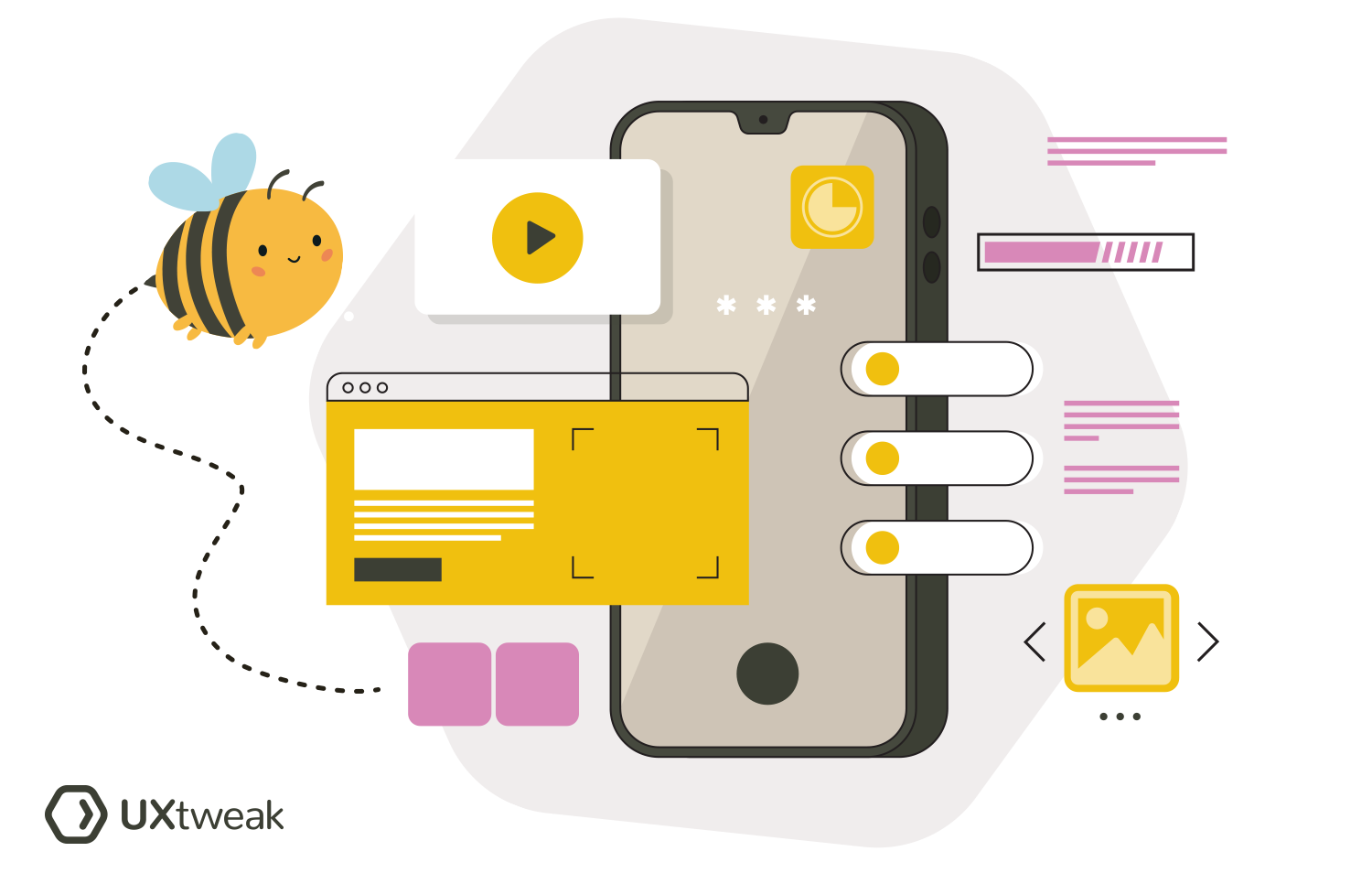
Each person learns in a different way. That’s why instead of just talking about concept testing in theory, we’ve prepared a real-world concept testing to use as an example and help you understand it in the big picture.
What concept are we testing?
The scenario we will tackle is the development of a new mobile payment service. We will walk through the whole process together and face the possible challenges while establishing which tools are the best to help us make progress through each phase.
We will also choose which concept testing survey questions would be fitting in this example to expand on our general guide.
Phase 1: Genesis
So, as we’ve established, imagine that you want to create a mobile payment service app. What you need to learn in this phase is what your future users expect to be able to do with your application.
Along with that, we aim to learn what they like/dislike about your direct competition, what are the pains your app would be able to help them with. If you have a list of nice-to-have features that could be expensive to develop, you can learn about your audience’s preferences and set your priorities accordingly.
First contact
When you start your development process, the first thing you need to learn from concept testing is whether your concept has a place on the market or not. Pitch the outline of your concept in a few sentences to your future users and follow it up with questions which are predominantly open ended.
In our case, the pitch could go something like to this:
“Our application – which we aim to launch in Q2 2023 – is focused on gathering all your payments in one place, helping you organize your spendings. The main planned features include:
- Banking services including USD, GBP and EUR bank accounts
- Debit and credit cards
- Fee-free currency exchange
- Direct transfers between accounts
- Your personal spending report with categories such as groceries, leisure, mortgage, etc.
Please refer to this description while you answer the questions below as honestly as possible. This survey is not a test, we are simply interested in your opinion.”
The questions you’re looking to ask include:
- Are you currently using any mobile payment service app? If yes please share which one. If you aren’t, please tell us why. – This question shows you which of your direct competitors is your biggest threat, as well as the attributes which could lead to convincing new users to enter the market.
- What do you like/dislike most about the application that you currently use? – Learn what are the must-haves for your application and what are the weak points of the competitors that you can exploit to get the edge on them.
- Which mobile operating system are you using?
- How many people live in your household?
- Are you the person responsible for handling the finances in your household?
- How often do you use your current mobile payment application? – We suggest providing options in this question to ease the analysis. For example: Multiple times per day, Daily, Multiple times per week, Weekly, Biweekly, Occasionally, Never
- How would you improve this application? – Ask for direct feedback on your pitch. The respondents tend to have different answers when they’re asked about the concept by itself and when it’s compared to other concepts.
- How likely are you to use this application? – Likert scale from extremely likely to not likely at all with a justification of why.
For the sake of the argument let’s say that the results from this initial survey show that your app finds its place on the market in the form you pitched it.
If the result was the opposite, you would need to seriously rethink which key features you plan to have included in your app, then try a similar survey with the altered pitch. Altering may not help either, which means the market isn’t ready for your concept and you may save tons of money by not pursuing it in its current form.

Dilemma
After you’ve successfully confirmed that your product is interesting for the market, you have learned that your budget only has enough money to add one new key feature to your app before the initial launch.
Your team is debating whether it should be stock trading or cryptocurrency payments. The voices in your company are split, so you wisely suggest asking your future users to join the decision process. You simply launch another survey with the same pitch.
Now you’re interested more in the voice of the people who are already using mobile payment apps, since they’re the ones these features are primarily for. Therefore, you screen participants using a simple question:
“Have you used a mobile payment application in the past month?”
If their answer is no, they aren’t interested in you at the moment, so you thank them and let them go without continuing. For those who qualify, there is only one other question:
“Please choose which of the following features you would prefer to be added to this application and why:”
A simple radio button question that asks for a justification will help you decide where to put your spare budget. Don’t be afraid to do a survey with only one question or small number of questions. Sometimes a survey like this can save your product.
Phase 2: Designing
After you’re sure you’ve established the outline of your concept correctly with the help of your users, it’s time to move forward to designing the details.
Start small
You have to start your design process somewhere. One of the ways to begin is with simplified low fidelity wireframes of the key screens of the app. Things like registration, login or other steps not included in the functional flow of your app may be omitted at this point.
In your case, you should start with the design of the screens that make up the meat of your app. This includes transaction creation, list of transactions, account details and balance, list of cards, etc. It’s a good idea to test the screens by themselves before testing the whole flow.
In reality you should test each of these pages, however for the sake of keeping this guide from growing into a monster, we will focus on two pages: list of cards and transaction creation.
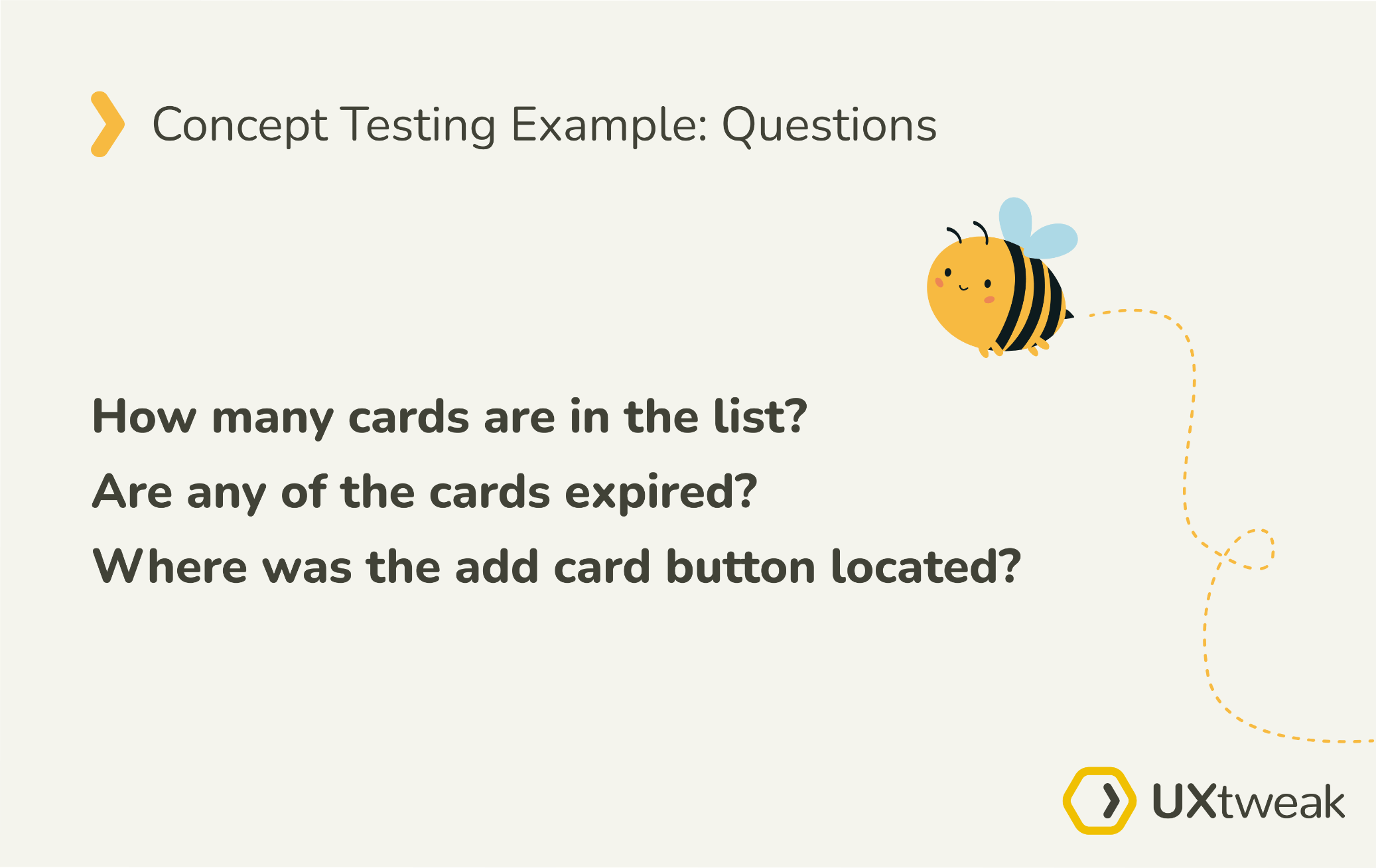
You want to make sure that the most important information really pops from the list of cards screen. To do this, you can go forward by testing your design using the Five Second Test tool. Here, you show your design to the respondents for a limited time and then check if they remember what we want them to remember.
In this example you would ask them questions like:
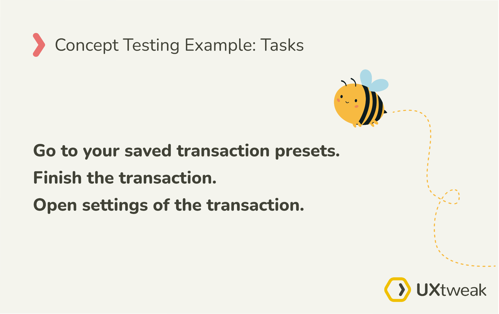
Similarly, if you’d like to know how your users would act, were they to see your screen design in front of them, there’s another tool for that. You can test the instinctive behavior of users on the transaction page using the tool First Click Test. In it, you can ask the respondents to click on the parts of the design which they believe would complete a task given to them.
Examples of tasks to test essential actions on the the transaction page could be:
This way you’re able to test that the users aren’t confused by other elements of your application/website when they are asked to complete a specific task.
First flows
Once you’ve tested the most important screens, it’s time to put them together into the main flows. In the case of your example payment app, one of the main flows is creating and executing a transaction. Other flows include exchanging currencies, reviewing the spending report or removing a card from your list.
Keep the designs somewhere between low and high fidelity so the users aren’t distracted by the design’s specificities, but the flow is realistic enough to be able to navigate through it. Once you have your flows ready in your favorite prototyping tool (such Figma, Axure or InVision) you can test them using tools such as Prototype Testing (Figma and InVision) or Mobile Testing. Ask your participants to complete a clearly defined task within your prototypes.
Using these tools you will see how lost your participants were while trying to complete the tasks you gave them. As we mentioned before, our main flow is transaction management.
The example task for this flow could sound something like this:
“Send 50 USD to your friend John Smith using an instant transaction.”
It’s important to not provide any unnecessary leads in the task text. Avoid using the same words as the labels visible in your prototype. However, be sure to make your tasks clear and understandable.
In this example, we expect the user to find John Smith in their saved accounts (since he is their friend), however we don’t mention this list in the task text to make sure we aren’t leading the user too much.
Figure out the details
With the basic flows tested, it’s time to improve on them. If you have a complex navigation tree in your app/web site, put it to the test using our Tree Test tool. In such cases, you should also probably think about this sooner, since bad structure can break an app.
In our case, you have a simple navigation which is only one level deep and was already tested via the First Click Test. Therefore using this test would be a waste of resources. Be smart about picking your tests.
The details that you move onto testing now are copywriting texts, help texts and design details such as the logo, illustrations and color schemes.

All these can be tested using either a Survey with images or via a Preference test. For example, you could create a Preference Test where you portray the same basic design in a few different color schemes and let the users decide which ones they prefer most. After that, you can do the same thing with different logo ideas.
This is however more of an experience oriented testing. From the usability side, we would pit different copywriting texts against each other with a situation pitched along with them to ask the respondents questions along these lines:
Which of the following names do you find the most fitting for a list where you can save the transaction details of accounts to use in transactions later?
- Address book
- Saved accounts
- Account list
- Quick transfers
Which of the following names do you think best represents a page with the analysis of your past spendings?
- My spendings
- Spending report
- Where did my money go?
- My reports
In preference tests like this, it’s important to randomize the option order, so none of the options is privileged in any way.
Phase 3: Complete concept
After you have your details figured out, it’s high time to prepare a complex prototype of your concept. Now it’s time to include all the technicalities such as login, pop-up notifications, etc. Make your prototype a true copy of your proposed production design and make sure all your main flows are correctly captured in it.
This is the last step before committing your concept to development which means it’s your last chance to save your money if there is a showstopper hidden somewhere in your concept. It is critical to give this step all the necessary time it requires, rushing anything at this point would be a step in the wrong direction.
After you have your final prototype ready, make sure you cover all the most important flows with the tasks you want to give to your users. Keep in mind that your task text has to provide all necessary information, but shouldn’t lead the respondent in any particular direction.
Some of the tasks that you would test for our example project would be similar to these:
- Learn how much you have spent on groceries during the past month.
- Add a new card to your card list.
- Exchange 500 USD for GBP.
Don’t save money on this step. make sure you have enough respondents who will go through your flows. Testing on 5 respondents has no meaning. If you discover any fatal flaws in your concept…honestly be happy. You have just saved tons of money.
Phase 4: Pre-launch
With your concept completely tested, you can now provide the specifications to your development team. Few months later, they have your product ready for the first launch. Since it’s an iOS app, now it’s time to upload our mobile payment application to Testflight and do one last proper testing using the Mobile Testing tool.
It’s a great idea to repeat the tasks from the last phase to check whether the implementation of your concept performs just as well as the concept did. This will show you if the implementation needs further tweaking or not.
If this final testing run goes well, you are ready for live launch and it’s finally time to get your app to real customers