
In order to be successful in a world where more than half of all online sales are made on mobile devices, it’s crucial to provide your users with a good mobile UX design. But how to achieve that?
In this article we are going to provide you with everything you need to know about mobile UX and testing and give you some tips and tricks to improve it. But first, let’s define what mobile UX design is and why it is so important.
What is mobile UX design?
Mobile UX design refers to the process of designing user experiences for mobile and other handheld devices such as smartphones and tablets. It is focused on creating products that are easy to use, visually appealing, and efficient for the user to accomplish their goals while interacting with the interface.
Mobile UX design includes a variety of activities that all work together to create a product which users love to use.
Some of these activities include:
- User research: conducting research on the end-users of your future mobile website or app to discover their needs, wants, pain points and expectations.
- Information architecture design: creating an intuitive navigation structure that helps users achieve their goals with the product.
- Interaction design: designing all the interactions and actions a user will take with the mobile app or website (swipes, scrolls, taps etc.)
- UI design: creating a visually appealing responsive interface that is consistent and in line with the branding.
- Usability testing: ensuring that the product is intuitive, easy to use, with no significant usability issues, and that users can easily perform all the important tasks within it.

Why is good mobile UX so important?
When creating a mobile app from scratch or even designing the mobile version of your website, taking your time to design good UX is important for a number of reasons.
First, a good mobile app UX assures your users will be able to easily achieve their goals with your application. This means that it doesn’t make any problem for them to buy a product or service through your app, log into it, and find any type of information they are seeking. This is beneficial for both you as a business and them as your customers.
Second, good UX significantly boosts the conversion rates. If a user downloads the app, but can’t navigate it or find something they need, they’ll probably leave and go to your competitors. Nowadays, people just don’t have the time to try and figure it all out. If they feel trapped and confused on a small screen size, they simply won’t use the website or application.
Investing in improving your mobile UX can help you avoid those problems and make sure users are satisfied with the experience they have with your product. Plus, good mobile user experience will leave a positive impression on a company as a whole.
How to improve your mobile UX design?
The best advice one can get on designing a good mobile UX is to design with the user in mind.
However, the mobile app design process can be rather tricky due to its small screen size. This is even more challenging when designing a mobile website, where you basically have to figure out a way of putting all the information from the desktop into a 2-3 times smaller frame.
Fortunately, there are plenty of mobile UX design tips that can help you. Here are some of the most important mobile UX best practices from Dribbble to keep in mind. We’ve also prepared a list of best practices for mobile UX design that you’ll find further in this article.
Another important aspect of designing for mobiles is to test your application with users throughout the entire design and development process. From the prototyping stage to the demo version, including the post-release, you can’t underestimate the value of mobile usability testing.
There is no better way to get real insights on user behavior than to watch them directly interact with your product and spot the confusions right away.

Mobile UX testing
There’s a quick and easy way to test your mobile app UX using UXtweak’s Mobile App Usability Testing tool.
This tool will allow you to give users specific tasks to complete inside the application and watch them interact with the product using voice and video recordings. The best thing is that you can try it for free with our Starter plan!
P.S. Apart from testing mobile apps, UXtweak also allows you to test mobile app prototypes, demo versions, and even mobile websites!
You can set up a mobile usability testing study in 5 easy steps:
1. Create a new study and choose what you want to test
Register or log in to the UXtweak dashboard and create a new Mobile Usability Testing study. Here, you can choose what you are going to test:
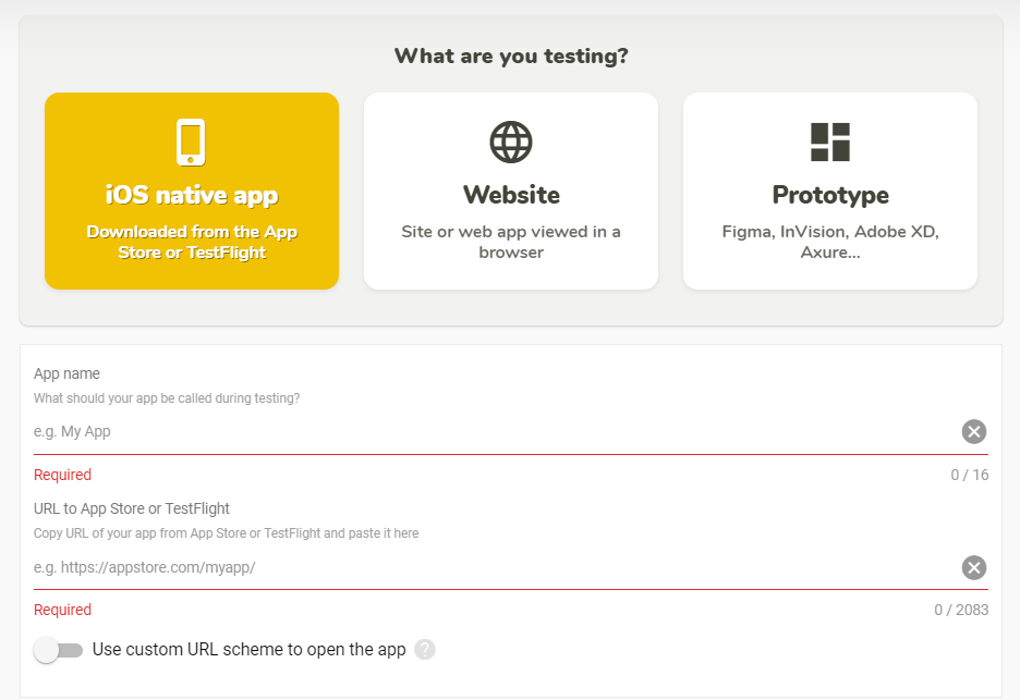
UXtweak Mobile Usability Testing tool
If you are testing an iOS native app, you’ll have to insert the AppStore link into either your app or a TestFlight link with the demo version of your application.
If you wish to test an app’s prototype or a mobile website, you’ll just need to provide its publicly accessible link.
2. Add tasks for the testers
The next step is to create tasks for your study. They should replicate real life scenarios and common user activities in your mobile app. For example, if you’re testing a clothing store’s mobile app, ask users to find an item and add it to the cart.
Learn to write actionable tasks for mobile usability tests.
3. Launch the study and share your link with the participants
If you already have the respondents for your study, all you have to do is launch it and copy the link. You can then send the link to your testers via email.
In case you don’t have the respondents recruited yet, UXtweak will be happy to help you with that! You can either get targeted testers from our 155M+ User Panel or set up the Recruiting Widget on your website and ask people to help you with your research for a small incentive.
4. Conduct the study
To complete the study, respondents first need to open your link on their mobile phone. They will be automatically redirected to the web guide and asked to install both your app and the UXtweak app, to guide them during the testing.
As soon as everything is installed, they will be presented with the study, and voice and screen recording will be turned on. The user will only need to read the task, switch to the testing app to accomplish it, and once they think they’ve finished, return to answer the study questions.
Here’s a short video that explains the whole process:
5. Analyze the results
After the study is finished, you can review the results. UXtweak stores all voice and screen recordings in your dashboard for easy access. The tool’s deep analytics will help you easily analyze the respondents and see the bigger picture of what needs to be fixed.
Analyze user behavior, evaluate their feedback, watch the recordings, and based on those insights, improve your mobile app UX.
Learn more about Mobile Usability Testing in our Guide.
Mobile UX design best practices
Simplify navigation
Keep the navigation simple and easy to use, with clearly labeled buttons or icons that make it easy for users to find what they are looking for. Avoid cluttering the interface with unnecessary elements or menus that can confuse or overwhelm users.
A great advice is to stick with common patterns and start by asking users how they’d expect the navigation system to be structured. For that, we recommend card sorting and tree testing research methods. They will help to understand user’s mental models better and build intuitive structure for your product.
Use Card Sorting to find out how users expect your content to be grouped and labeled. Based on the collected data, come up with potential models for your app anatomy. You can then evaluate them with tree testing and see which one works best!
Minimize the amount of content
On a small screen size, there is no place for clutter and huge amounts of information. Your job is to make the interface seem clean and minimalistic in order to not frustrate the user. Keep the amount of content to a minimum, using progressive disclosure to gradually reveal more detailed information as needed. This can reduce cognitive load and improve ease of use.
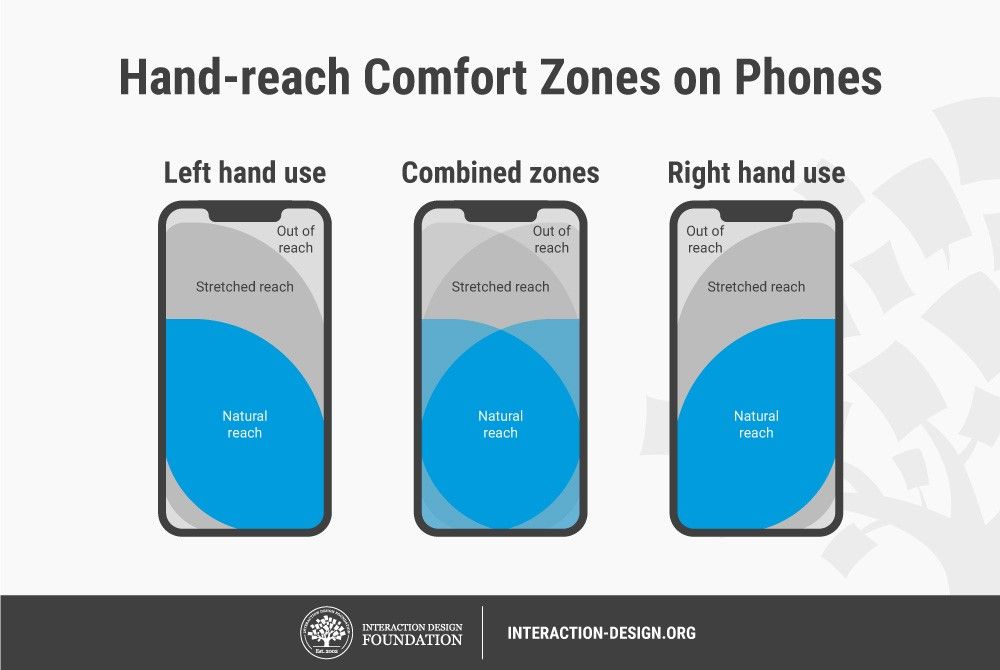
Design with hand-reach comfort zones in mind
One of the main rules to keep in mind when designing for mobile interfaces. Place frequently used or important elements within easy reach of the user’s thumb, and avoid placing important elements in hard-to-reach areas of the screen.
Here’s a great example of the zones we’re talking about.
Avoid the long-scroll
Long scrolling pages can be difficult to navigate, particularly on mobile devices. Instead, use clear visual cues and separate sections to break up content into manageable chunks that are easy to scroll through.
In some cases, long-scrolling pages may be appropriate and effective, particularly for storytelling or visual-heavy content, as long as they are designed in a way that is easy to navigate and use. However, most of the time, when it comes to designing the UX of mobile websites or apps we recommend to avoid using long-scrolling to not make users feel lost and frustrated.
Use familiar patterns
Stick to common mobile design patterns and conventions, such as using recognizable icons, buttons, and gestures, to make it easy for users to understand and navigate your app or website. Remember, that there is no need to reinvent the bike. Your users already have apps and websites that they use every day and most of them have similar layout and navigational elements.
Therefore, they have certain expectations of your design and its functionality too. To ensure intuitiveness and live up to those expectations, stick to familiar patterns when possible.
Optimize for touch
Design for touch interactions, with large, easy-to-tap buttons and interactive elements that are spaced out and easy to select. This can help to improve the overall user experience, making sure that there’ll be no accidental clicks and no tiny buttons that are hard to locate.
Optimal button sizes for mobile UX: Apple recommends 44×44 pixels for iOS, and Google recommends 48×48 pixels for Android phones.
Test with users
Last but not least, to ensure that your mobile UX design exceeds customer expectations, we recommend to perform mobile usability tests throughout the whole UX design process.
For that you can use UXtweak Mobile Usability Testing tool that allows you to test anything from mobile websites and apps, to design prototypes and app demo versions.
